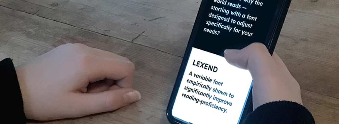
In the realm of web design, where every pixel counts, typography emerges as a silent yet powerful artist, shaping the visual language of a website. Beyond mere letters and words, the art of typography influences user experience, communicates brand identity, and transforms the digital canvas into a captivating masterpiece. In this blog post, we’ll unravel the nuances of typography in web design, exploring tips and insights to elevate your websites with the magic of fonts.
1. The Role of Typography in User Experience
Typography is more than just choosing fonts; it’s about creating an immersive and enjoyable reading experience for users. Selecting the right typefaces, font sizes, and line spacing impacts readability, ensuring that users can effortlessly consume your content.
2. Font Pairing: Finding the Perfect Harmony
The art of font pairing is akin to selecting the right ingredients for a recipe. Experiment with combinations of serif and sans-serif fonts to create visual contrast. Consider the mood and tone of your content; elegant serifs may suit a luxury brand, while clean sans-serifs might be ideal for a modern tech site.
3. Hierarchy for Clarity and Emphasis
Establishing a typographic hierarchy guides users through your content with clarity. Use variations in font size, weight, and style to signal importance. Headings, subheadings, and body text should work together harmoniously, providing a seamless reading experience.
4. Responsive Typography: Adapting to Every Screen
Responsive design extends beyond layout to include typography. Ensure that your chosen fonts scale gracefully on different devices. Use relative units like ems and percentages to maintain consistency across screens, from desktops to smartphones.
5. Whitespace: Allowing Typography to Breathe
Whitespace, or negative space, is the unsung hero of typography. Give your text room to breathe by incorporating ample whitespace around paragraphs, headings, and other text elements. This not only enhances readability but also adds a touch of elegance to your design.
6. Custom Fonts and Brand Identity
Custom fonts contribute to brand identity by providing a unique and recognizable visual signature. While system fonts are reliable and widely compatible, custom fonts can elevate your brand by adding a distinctive touch. Just ensure that custom fonts are optimized for web performance.
7. Accessibility: Making Typography Inclusive
Accessible design is a fundamental principle of web development. Choose fonts with good legibility, provide sufficient color contrast, and consider users with visual impairments. Accessibility in typography ensures that your content is available to a diverse audience.
Join the Typography Talk!
What’s your favorite font pairing or tip for creating visually stunning websites? Whether you’re a seasoned designer or a typography enthusiast, share your insights, recommendations, and questions in the comments below. Let’s engage in a Typography Talk and celebrate the artistry of letters on the digital canvas!
Follow Us on Facebook!
Ready to continue the conversation and explore more insights? Follow our Facebook page The MarkEr PH for ongoing discussions, community highlights, and to learn more about the services we offer!
